Brand analysis, product design, and packaging design for Trader Joe's.
Brand Analysis
Trader Joe’s brand identity uses a unique approach that deviates from conventional retail design norms. Instead of adhering to a consistent, standardized aesthetic across all products, the company embraces diverse visual communication tailored to each product's story or theme. While many design systems that lack a unified structure are criticized for appearing disorganized or overwhelming, Trader Joe's successfully leverages this approach to create a vibrant and engaging shopping environment.
Trader Joe's packaging design often includes:
• Analog Aesthetic: Despite being created digitally, the packaging designs often replicate a handmade look, such as textured backgrounds, imperfect linework, and mimicry of analog design processes.
• Playful Type: Typography is often serifed and takes a maximalist design approach.
• Thematic Imagery: Design choices and icons align with a product's origin/region.
Concept
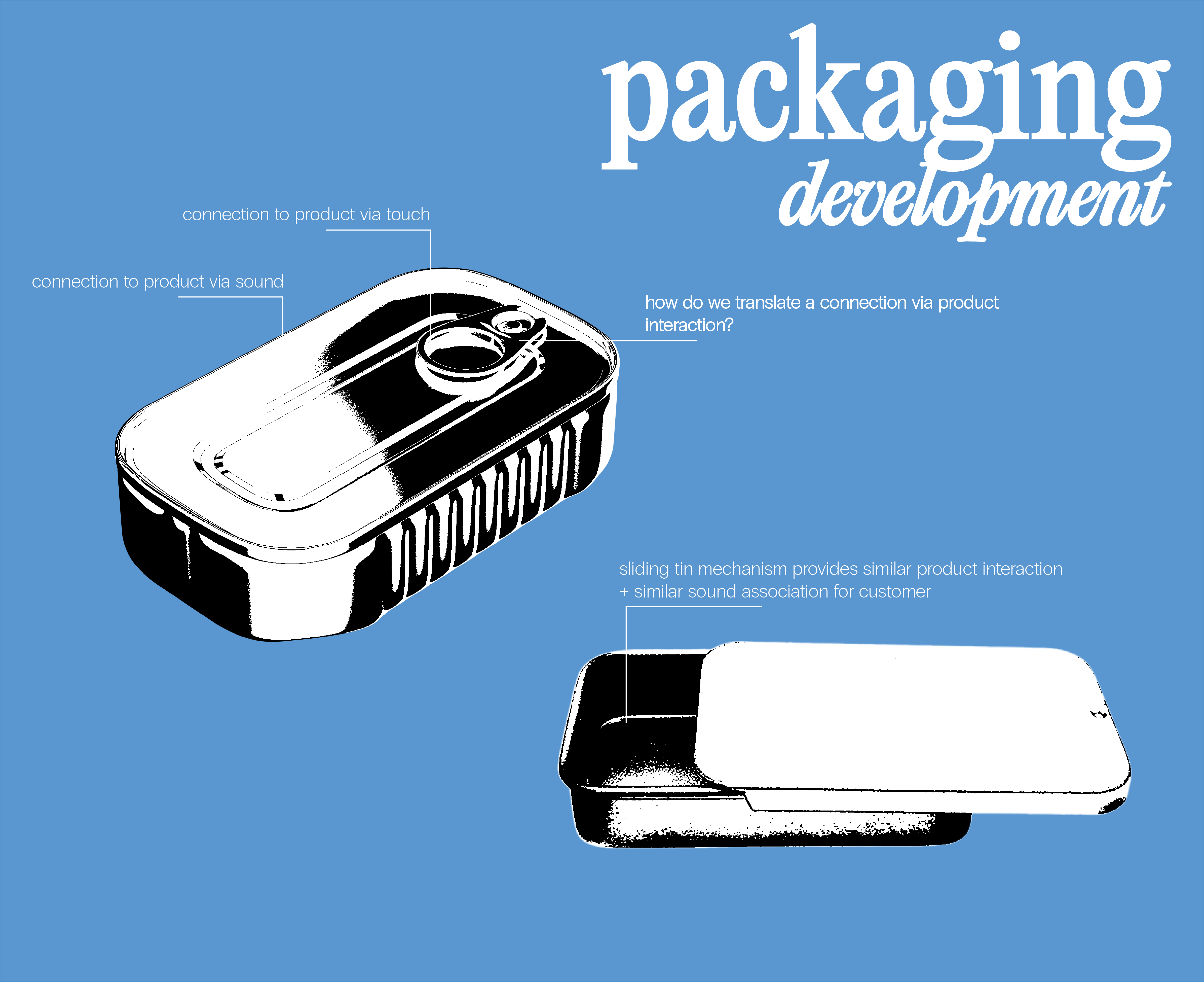
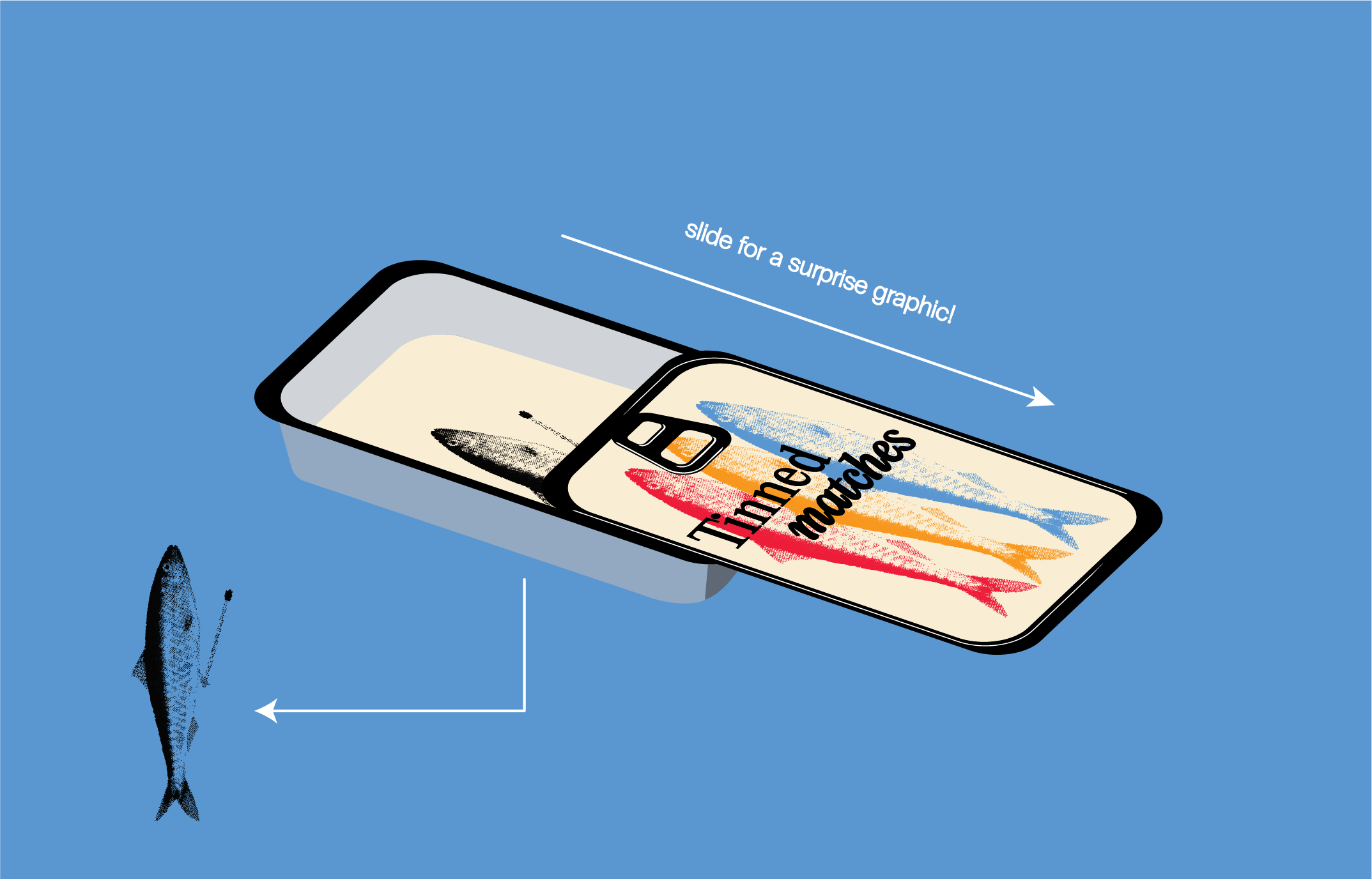
Using the identified brand principles, I innovated on the common matchbox. Inspired by the rising popularity of tinned fish, these matchboxes take on the form of a small slide-top tin. The durable, reusable packaging mirrors the act of opening tinned fish, creating a playful, thematic connection.
Key Elements
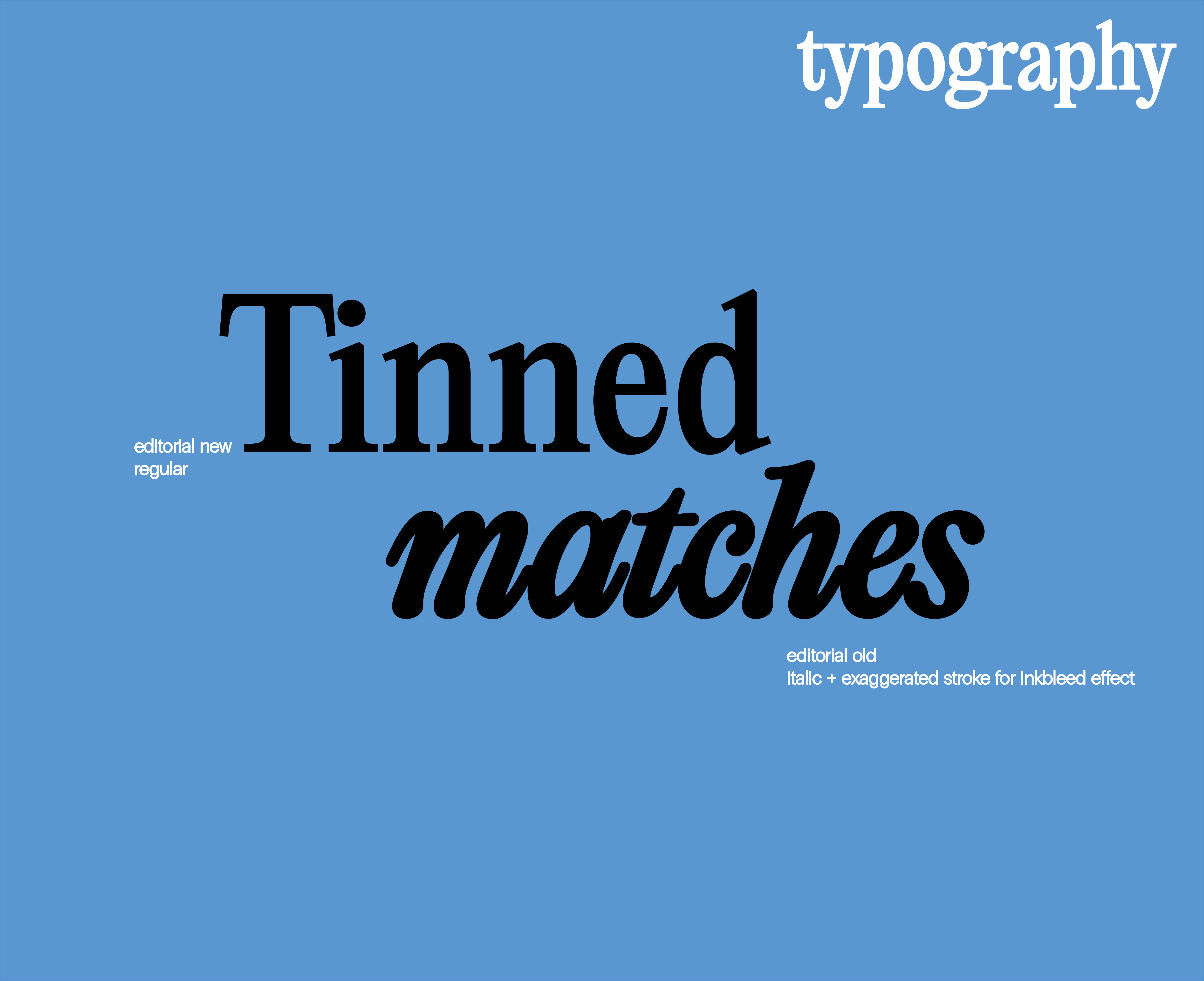
Typographic Layout: The design incorporates Editorial New and Editorial New Italic in an ink bleed style. Using an italic variation for the word "matches" enhances the playful tone of the product while introducing contrast for visual interest. The typography interacts thoughtfully with the brightly colored background, with pixel-level adjustments ensuring dynamic and engaging shapes.
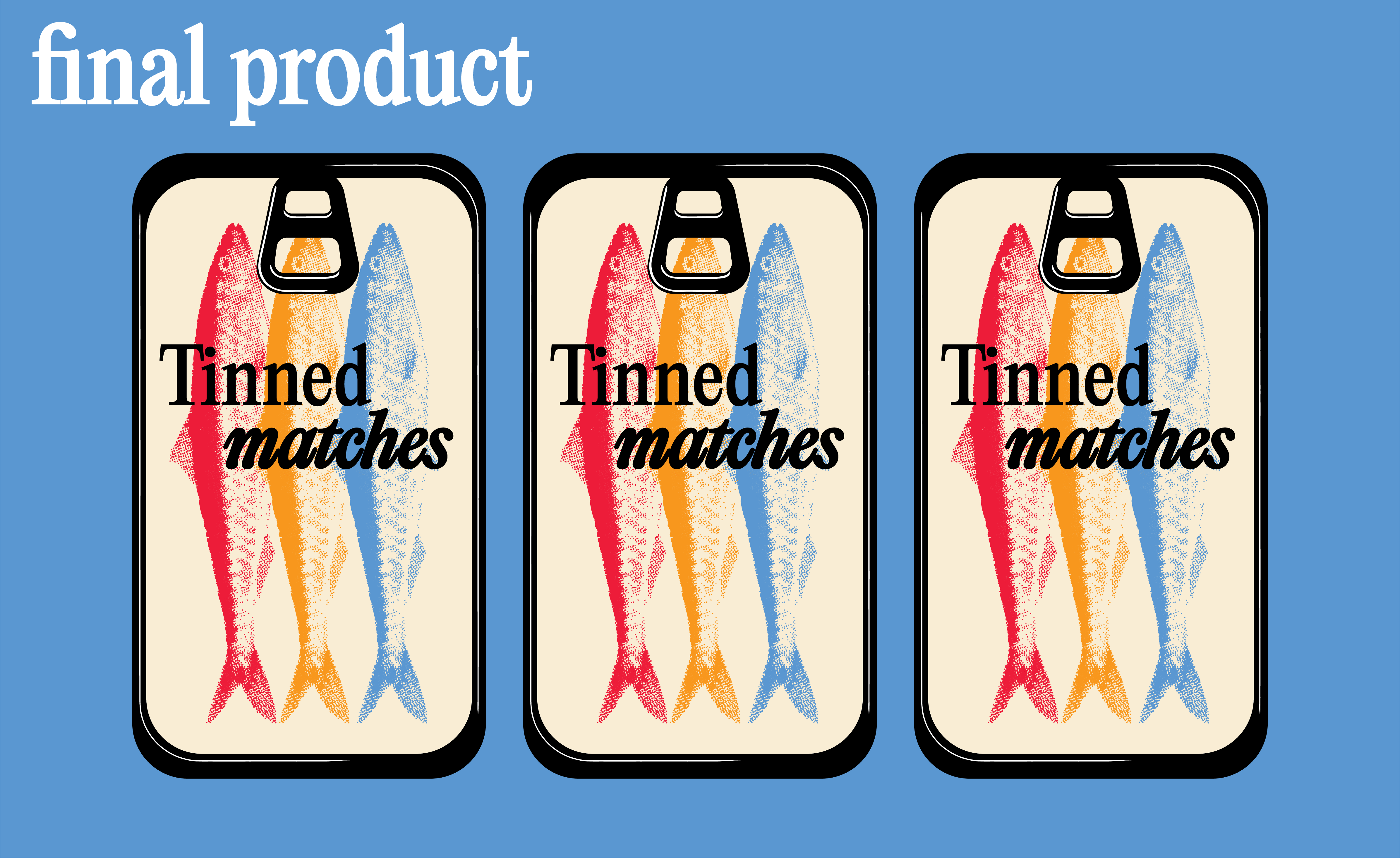
Analog Graphics: The fish graphic features a halftone effect, evoking the nostalgia of close-up print processes. This analog-inspired texture adds depth and charm, contrasting effectively against the vintage yellow background. The choice to use over-exaggerated black outlining in the type also nods to an ink bleed effect, tying into the print theme.
Thematic Color: A vintage yellow background provides a warm base that allows the red, orange, and blue fish graphics to pop. These vibrant hues nod to classic tinned fish packaging, which often incorporates bold contrast and timeless color combinations.